Intro
This is a case study based on my user experience research with a real client, Cucko, a Brazilian club from Porto Alegre, for whom I developed an exclusive app for its customers. I emphasize that the user discovery and solutions realized occurred before the covid pandemic.
Design Process
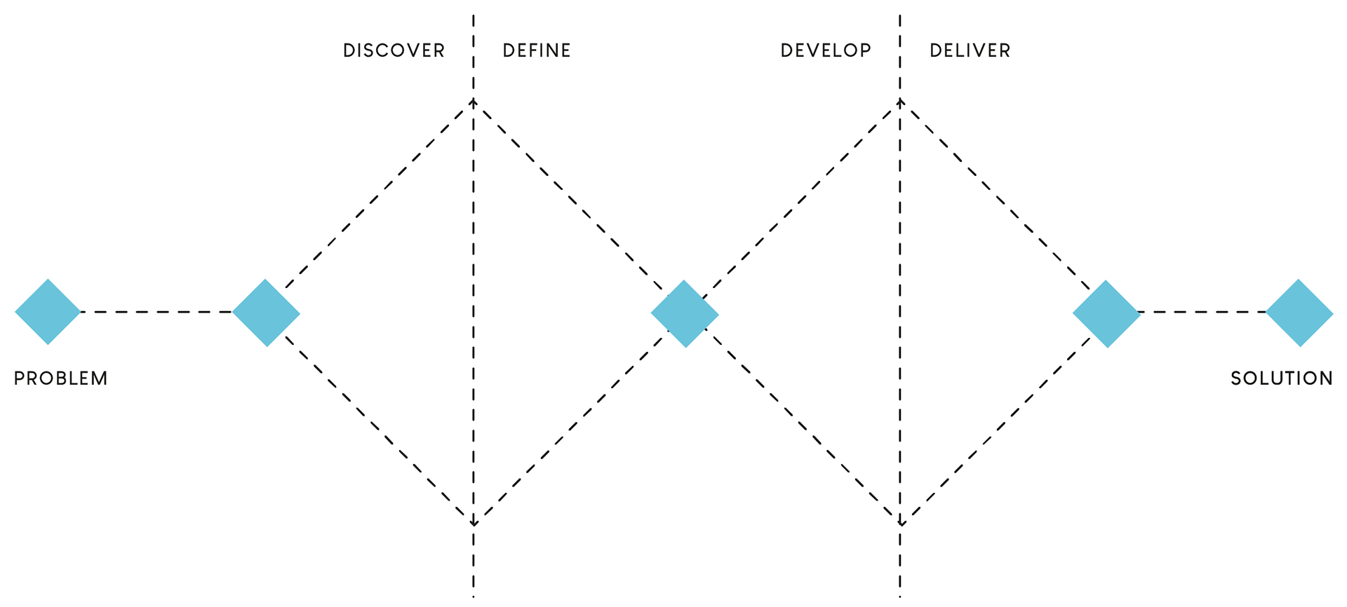
I utilized the double diamond diagram system to design the project (discover, define, develop, and deliver).
General Problems
• Brazilian inflation's effect on food/beverage prices causes regulars to stop going.
• When the club's crowded, there's discomfort due to long lines at the bar and paying the final bill.
• When the club's crowded, there's discomfort due to long lines at the bar and paying the final bill.
Project Goals
• Discover and comprehend Cucko's pains and satisfaction, as well as who his customers are.
• Figure out how to make it a more pleasurable experience for them.
• Validate a new digital product that distinguishes itself from the competition.
Discover
To understand the scenario with which we are dealing while implementing the project. We employ both discovery methodologies, as well as qualitative and quantitative research.
In the quantitative research, we used a survey with some of the most diverse club regulars to find out what they like and dislike about the club experience. Also included is an in-depth interview with five long-time partygoers.
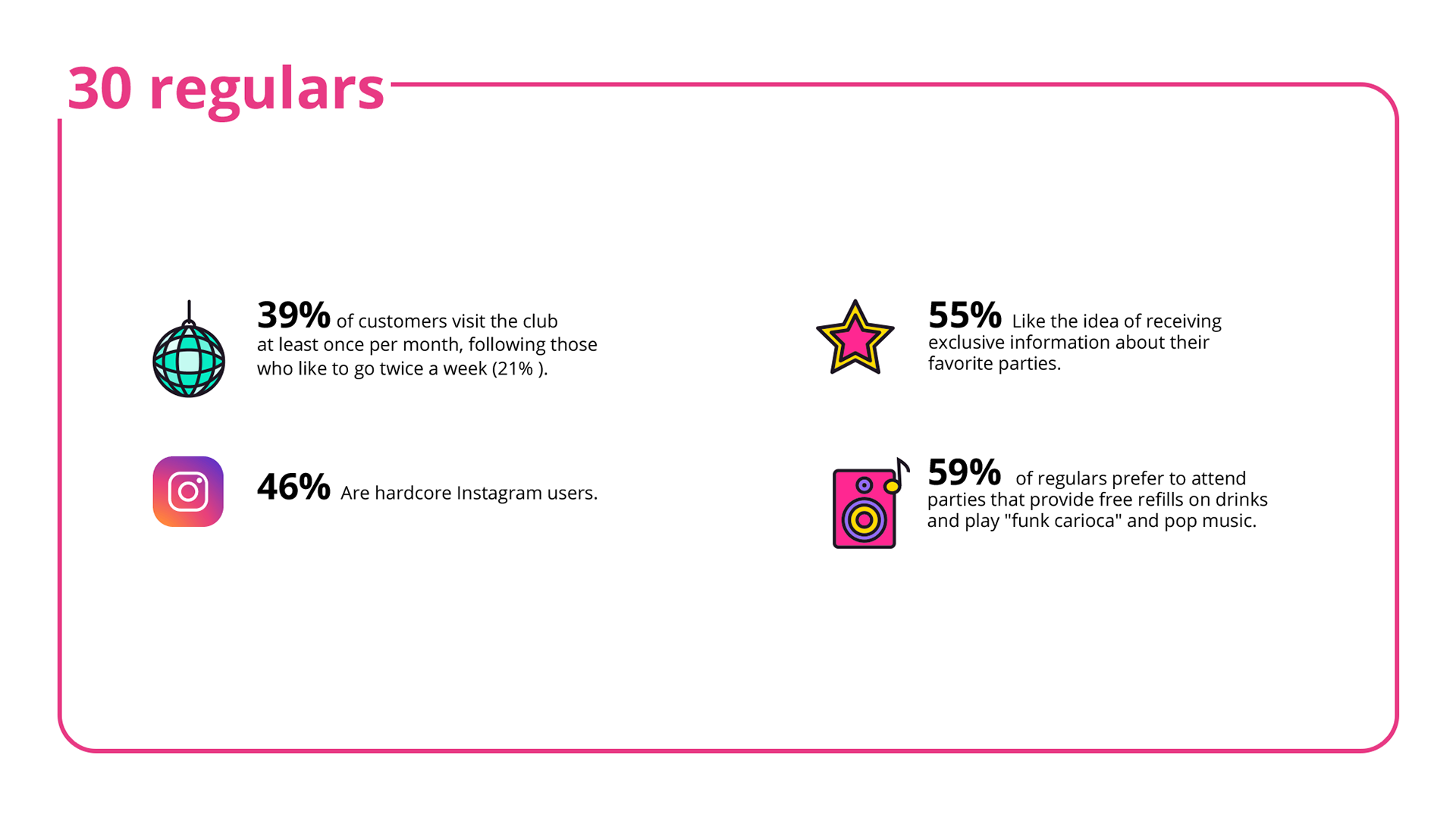
Quantitative Research
It was created a simple and friendly questionnaire for the users' consumption habits, which received 30 responses. The following are the most important points:
Qualitative Research
I conducted five in-depth interviews with regular partygoers to learn more about their experiences at the club. I also inquired about their opinions on the club's inclusiveness and the topic of rising food and beverage costs.
The most significant user reviews are as follows:
The most significant user reviews are as follows:
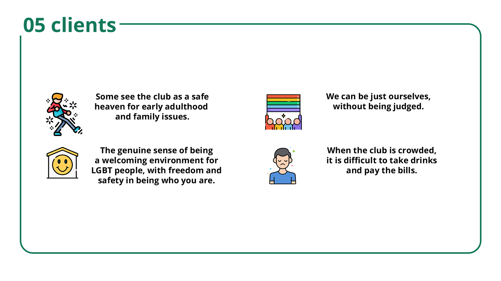
Research Findings:
During the user research, I learned several intriguing things regarding the issues users were having and their enthusiasm for the club. That proves they are evangelists' patrons since they invite friends to the events and spread the word about the venue to those outside the club's exclusive circle.
Define
Based on the results of the user study, various patterns and hypotheses were developed in order to establish personas and a benchmark with the major figures in the Porto Alegre nightlife.
Personas
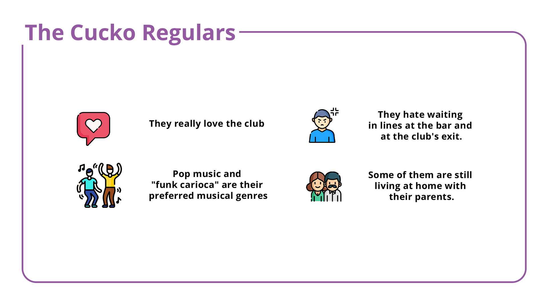
Personas are controversial, yet we built two of them using data from real people in our user interviews. The club attracts a wide variety of people, but in this instance, we have identified some significant behavioral similarities among our regulars. It is simpler to understand the features of the digital product when you concentrate on these two groups of people:
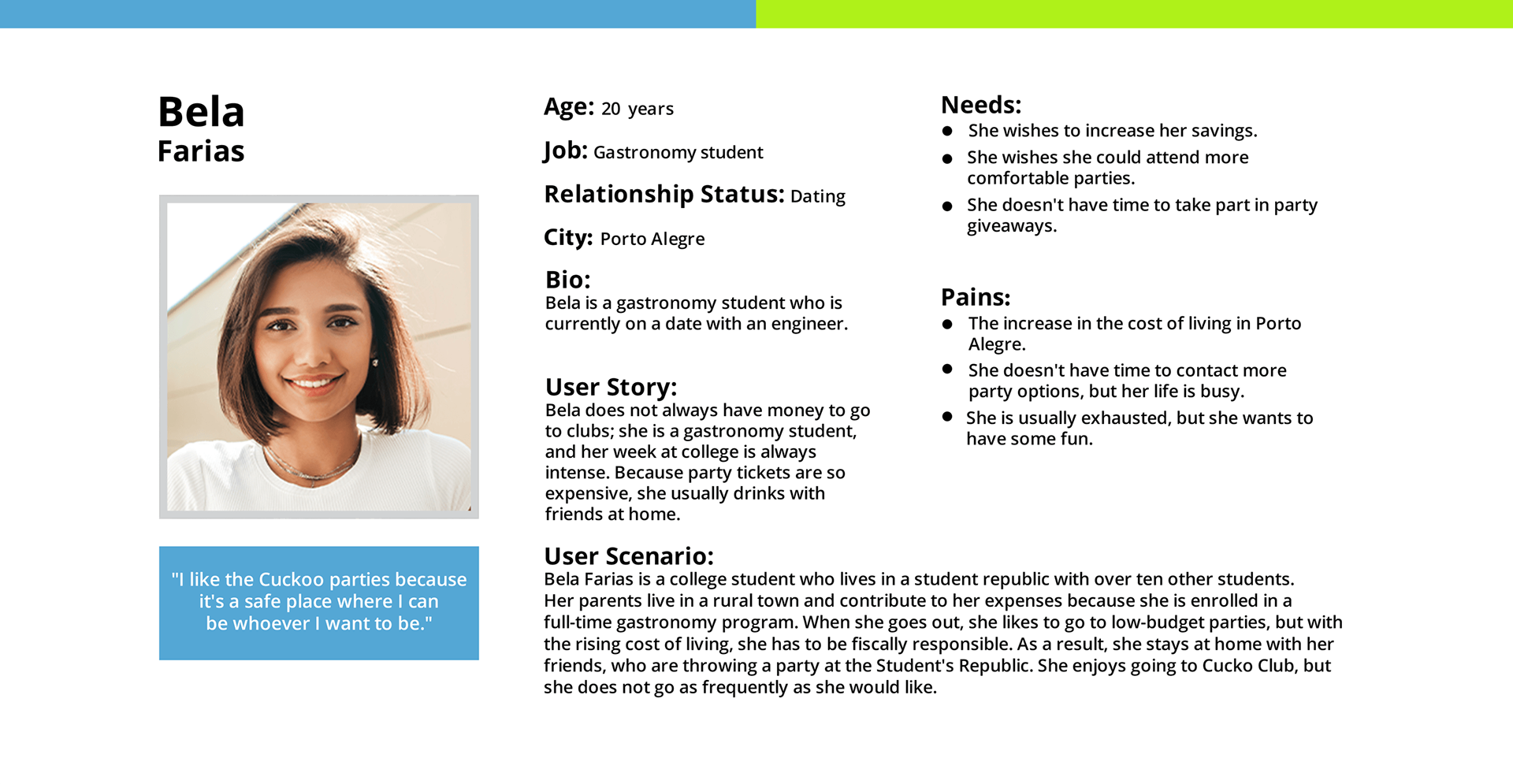
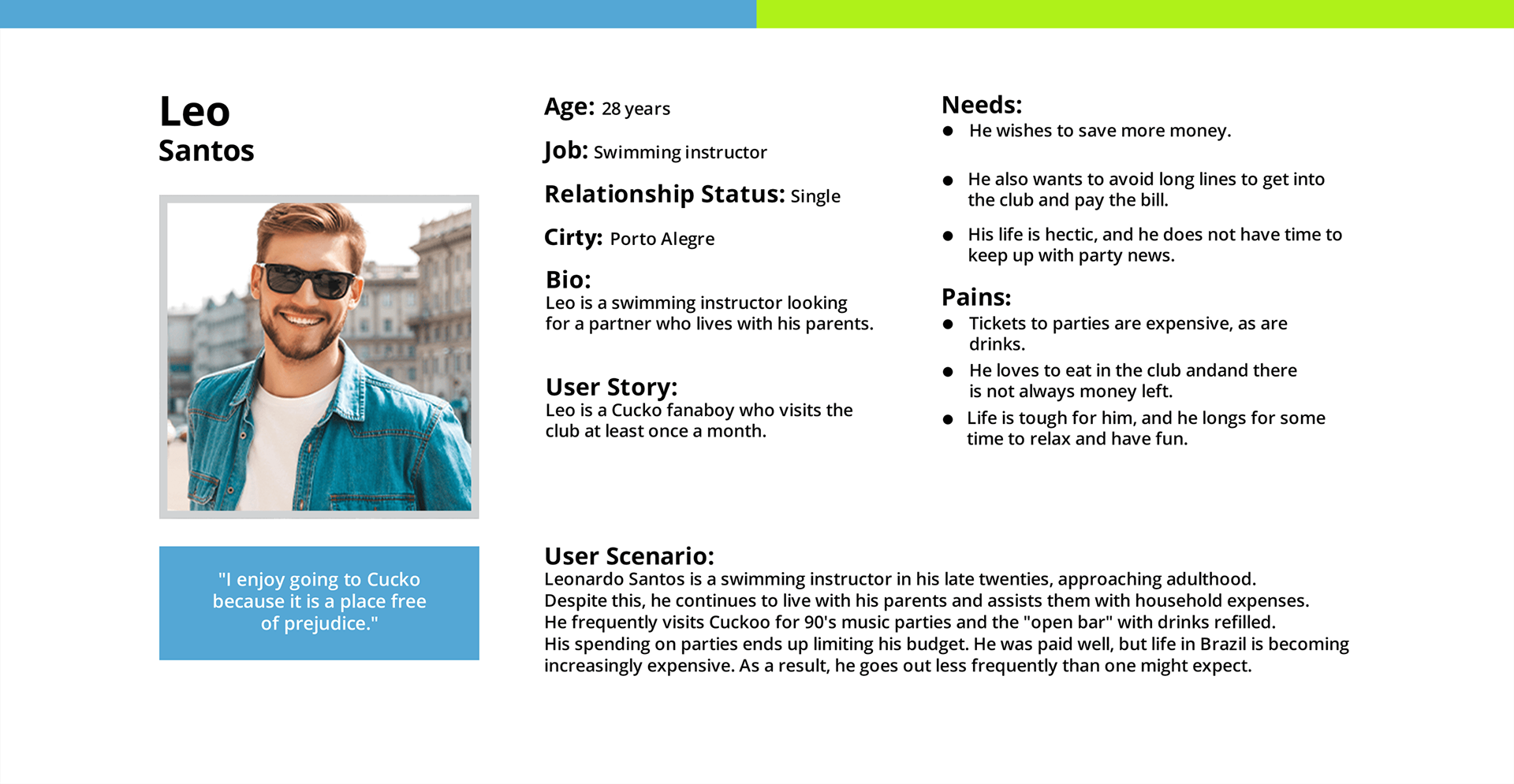
Despite how different the personas are, I discovered some common issues between them:
• Discounts on drinks and food are required.
• Due to high demand, the club's service is of poor quality.
• Long queues for beverages, food, and paying the bill.
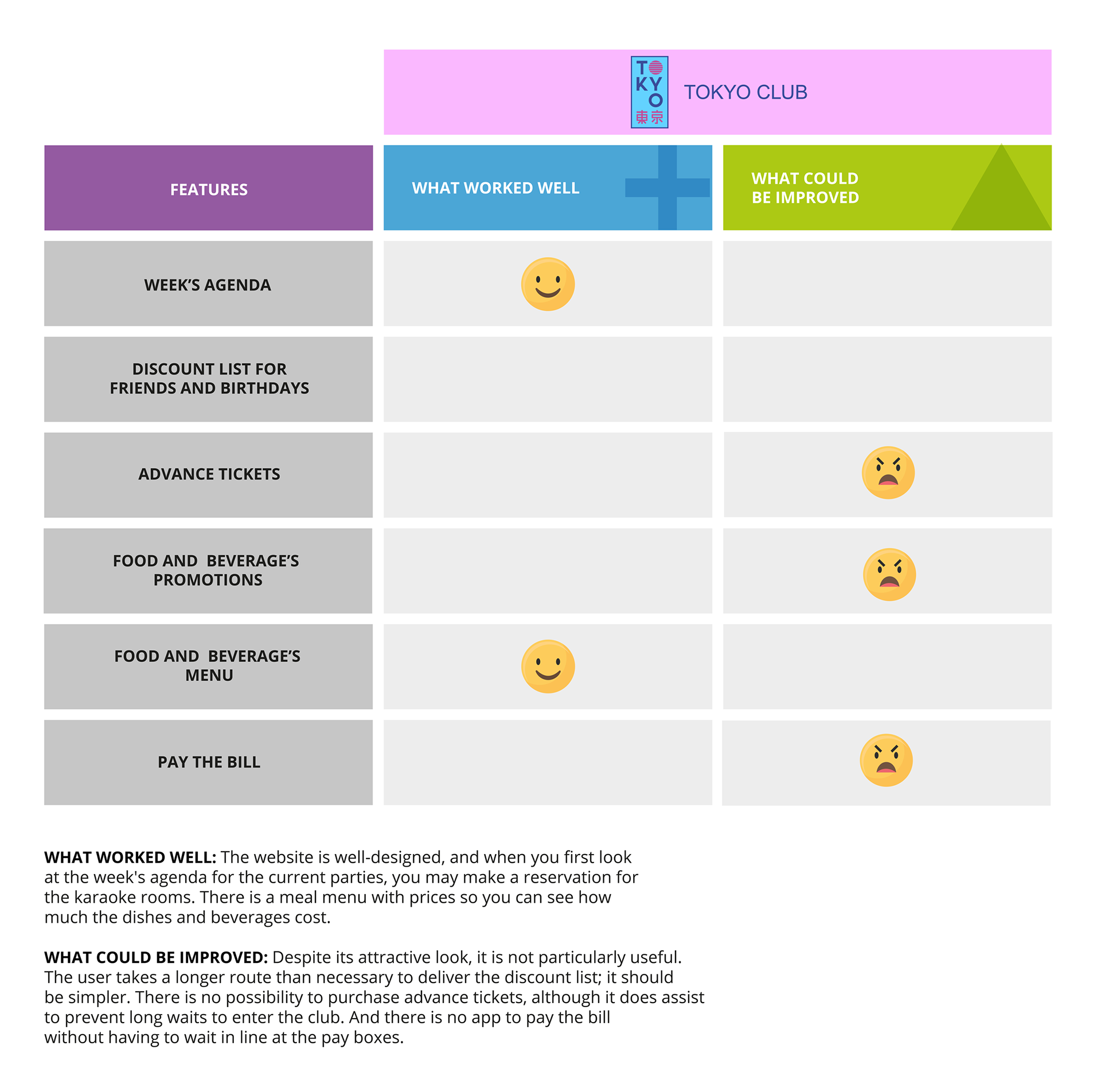
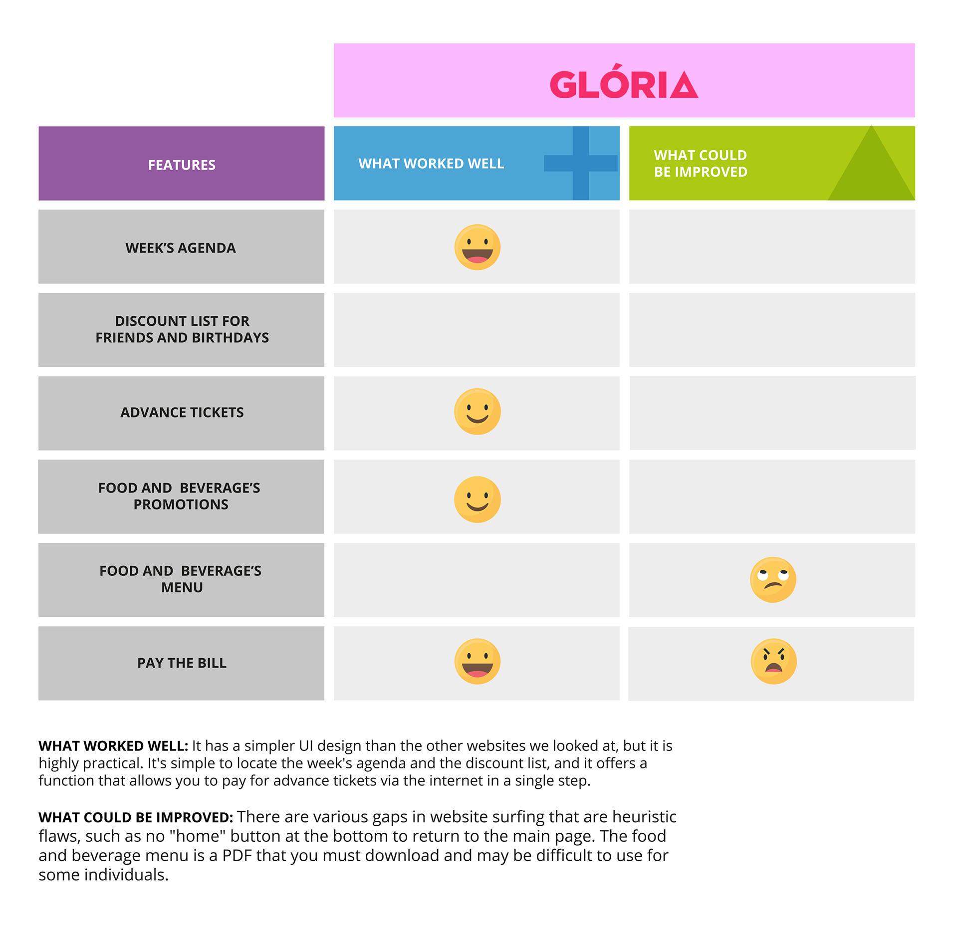
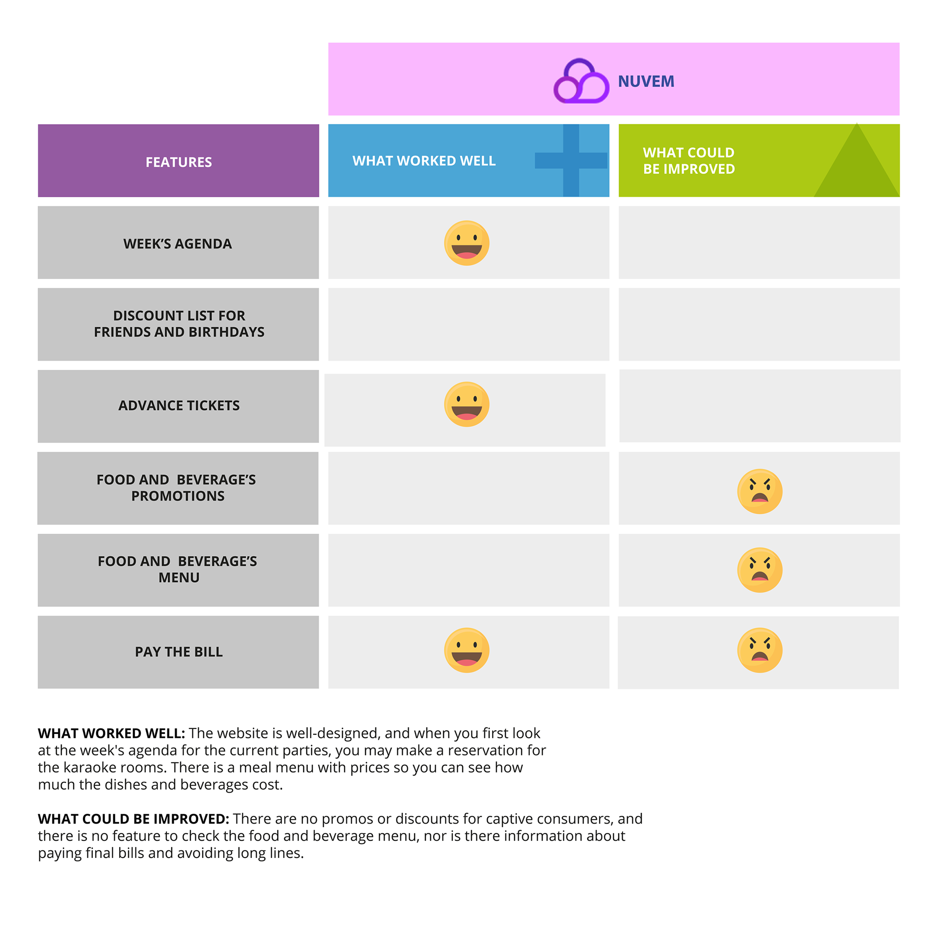
Competitor Analysis:
To better understand how Porto Alegre and So Paulo official clubs use digital channels to keep their regulars, two club websites with the similar audience were analyzed. highlighting the positive and negative aspects of each feature on the website We learned during our research that none of them had a formal mobile app. As a result, we may discover the key elements of a digital remedy for the client's issues.
So I use the plus and deltas to show it practically:
User Journey
I discover how each website operates to provide a client experience after researching its rivals and features. With that information, we design a user journey on the Cuckos official website and an offline journey at the club to identify the club's weak spots and consumer requirements for a positive experience. We employ both of the established user personas.
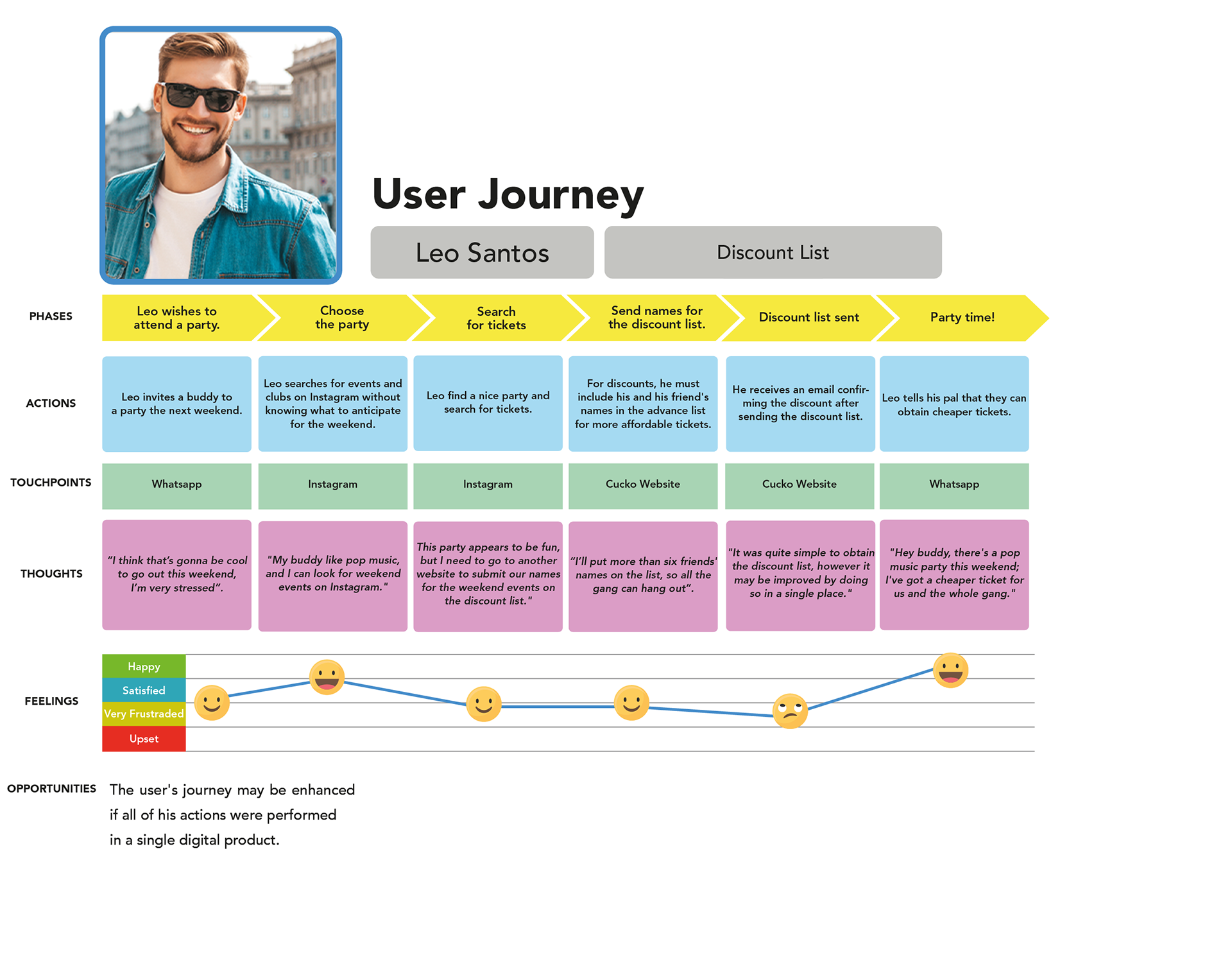
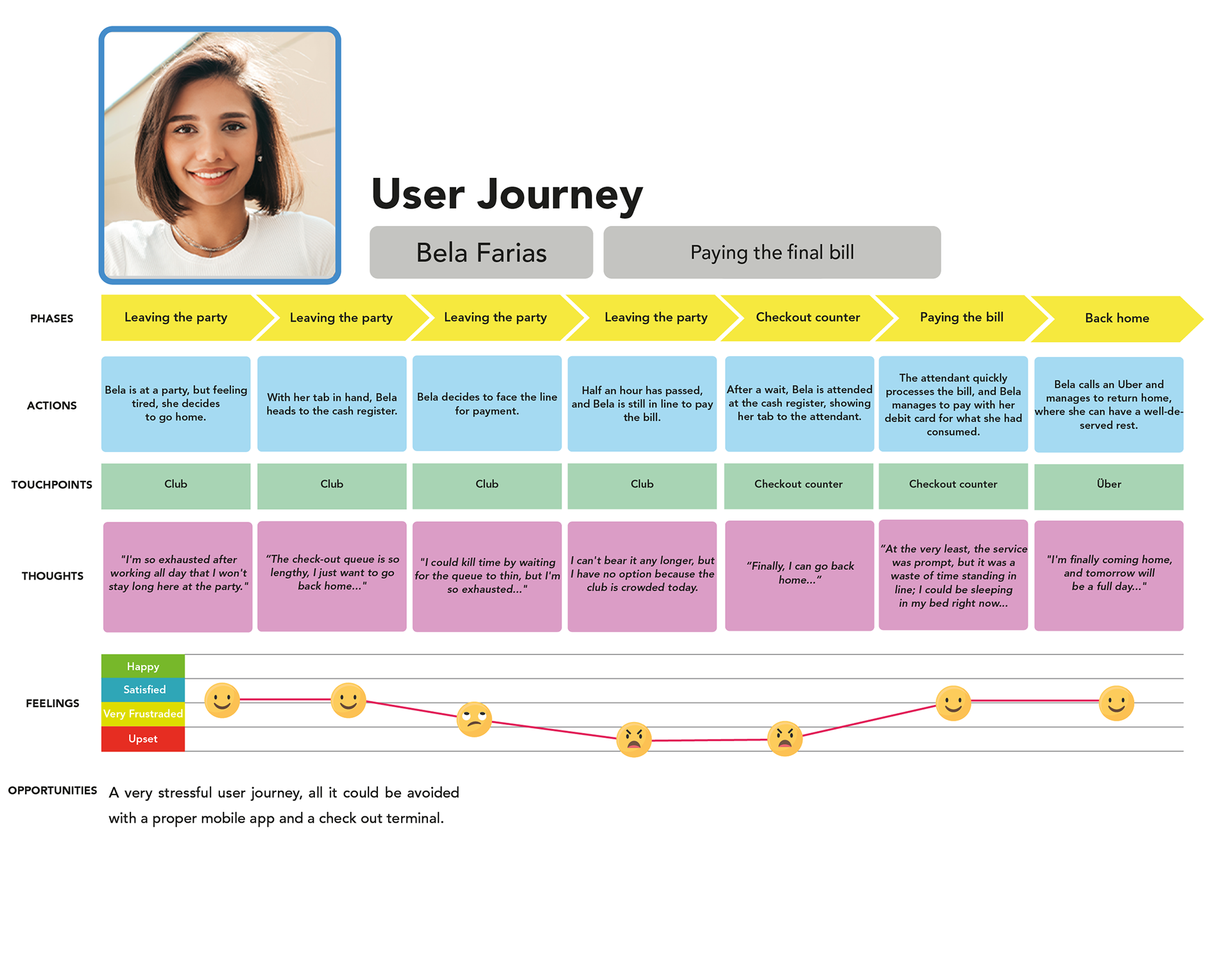
Learning what functions in both offline and online trips may help define what works in a new digital solution. The club experience can be increased and customer service rendered more joyful by offering cheaper promotion rates and the option to circumvent large lineups.
Develop
Now with the possible solutions from the previous step, we can prioritize the features and resources to build a minimum viable product. So in this phase, a mobile app could be interesting for the club.
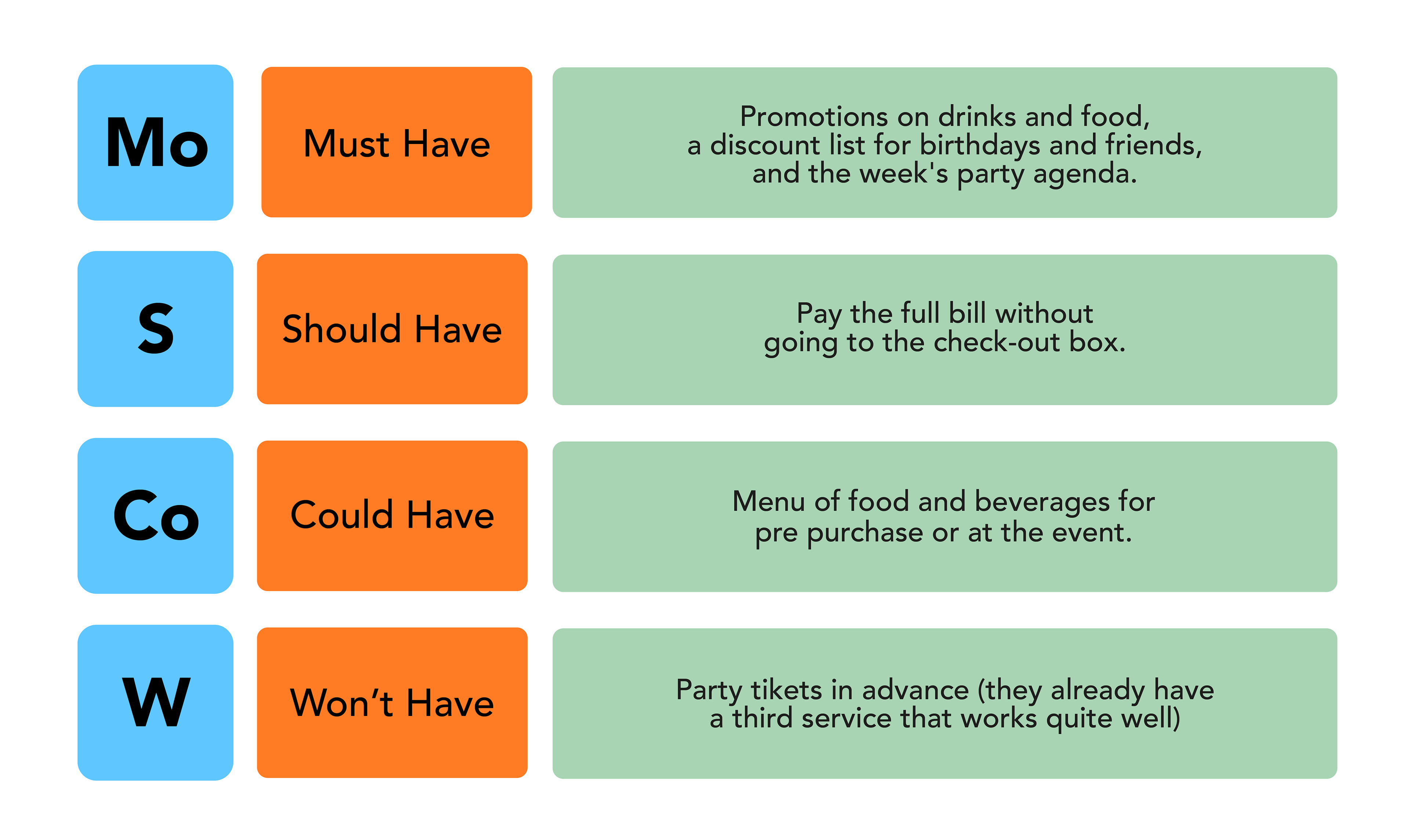
Moscow Method
I use the Moscow Method to prioritize resources and features, and we take what matters for a strong customer experience on online and offline experiences, to make people's life easier, but we also consider what may be improved.
Sitemap
Realizing through user behavior analysis that certain problems with the user experience could be resolved by a stand-alone digital platform apart from social media. since it seems like it would be really helpful for people to utilize when having a party. The most sought-after club services, as determined by our research using the Moscow Method, will be the MVP's objective.
• Food and beverages promos.
• Birthday promo with guest lists.
• Exclusive discounts for the week's events.
• The option for locals to pay their bills using the app eliminates long lineups.
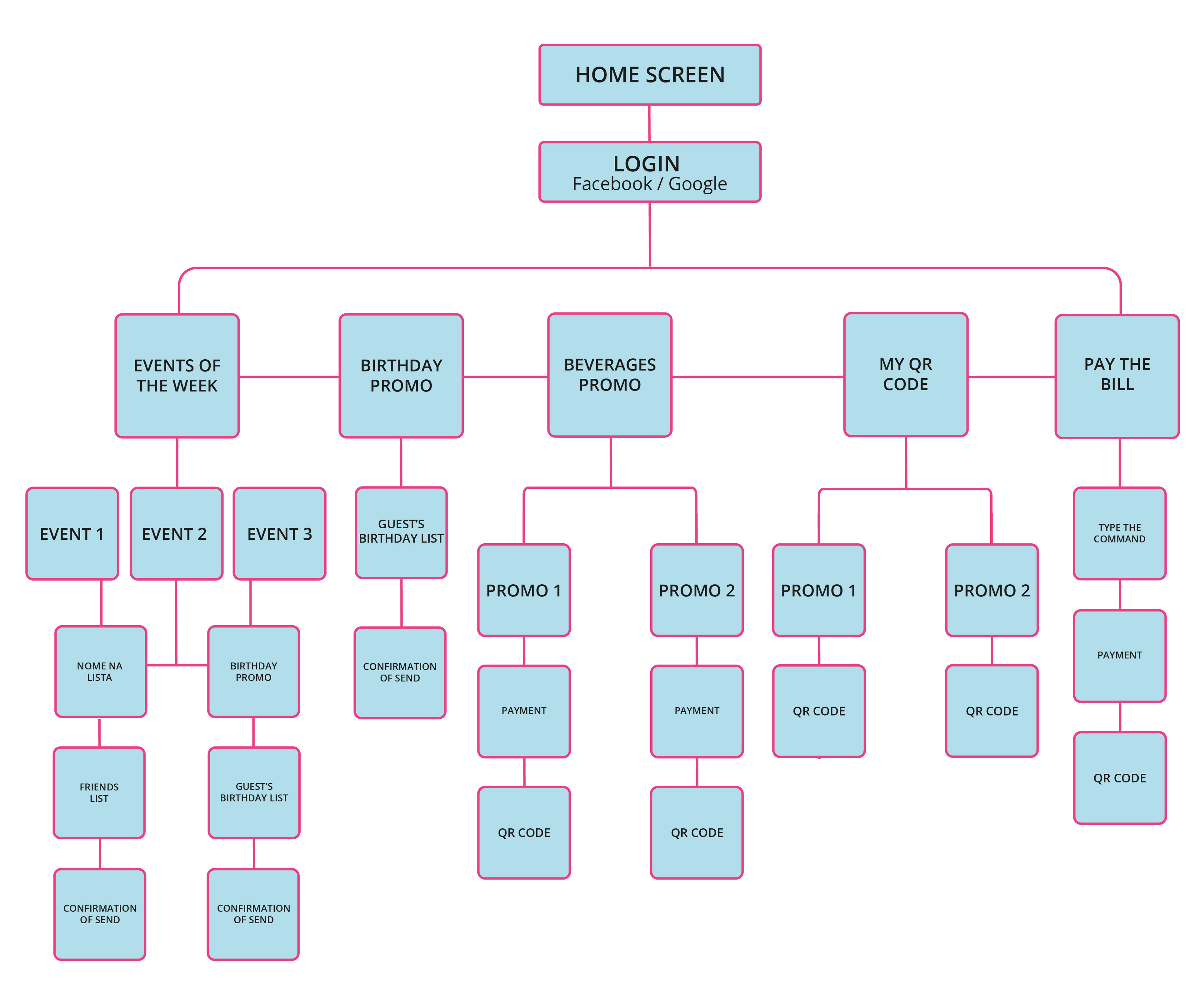
With these user goals in mind, we built a sitemap that demonstrates how the user may meet their goals in a clear and simple way. Even in a place like a nightclub with low lighting and a large crowd.
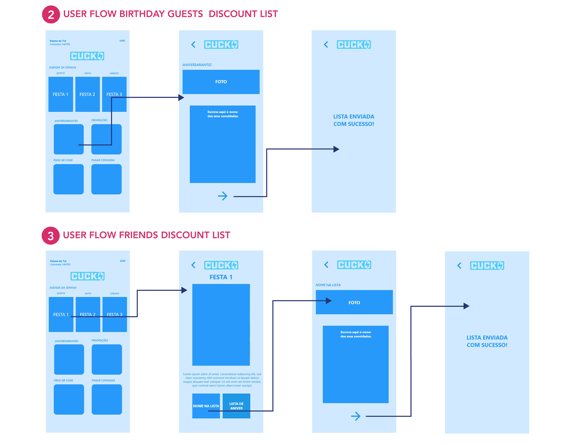
Wireframes
It was created in a very minimalist style, looking for the simplest way for the user to achieve their goals. Given that the user can select a beverage promotion in the midst of a packed party, displaying the QR code for the bartender taking the order. And the ability to pay the final bill without having to go to the pay box and avoid long waits.
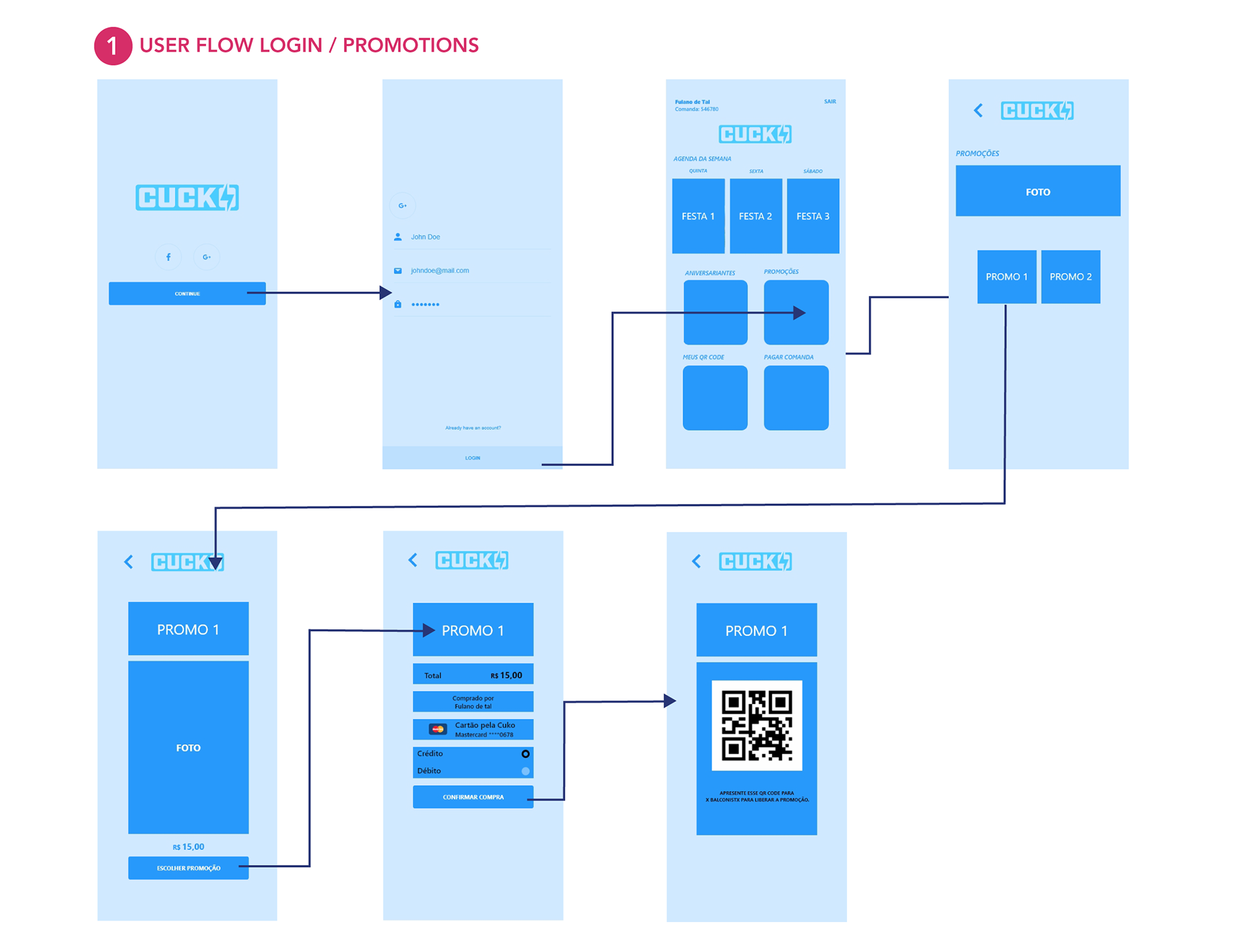
User Tests
Based on the client's visual identity, we developed medium-fidelity user interface screens using wireframes. So, with Adobe XD, we created an interactive prototype. Additionally, we conducted additional user testing with club regulars. We invite them to do some easy tasks like:
• Send a list of birthday discounts.
• Pick an event and submit the names of your friends for the guest list.
• Pick a promotion.
• Retain a QR code from the selected promotion.
• Pay the last invoice.
Using the Zoom program, the test was conducted remotely with 5 regulars. Some of these individuals served as the basis for the user personas. Most of them completed the challenges quickly and without any difficulties:
15 seconds: pay the final bill and pick a promo.
10 seconds: send friends' names for the discount list and redeem a QR code.
Users generally appreciate how simple it was to utilize the program. They also enjoyed the option to pay the bill without visiting the cashier. They claimed that it could benefit the club by increasing the long waiting lines.
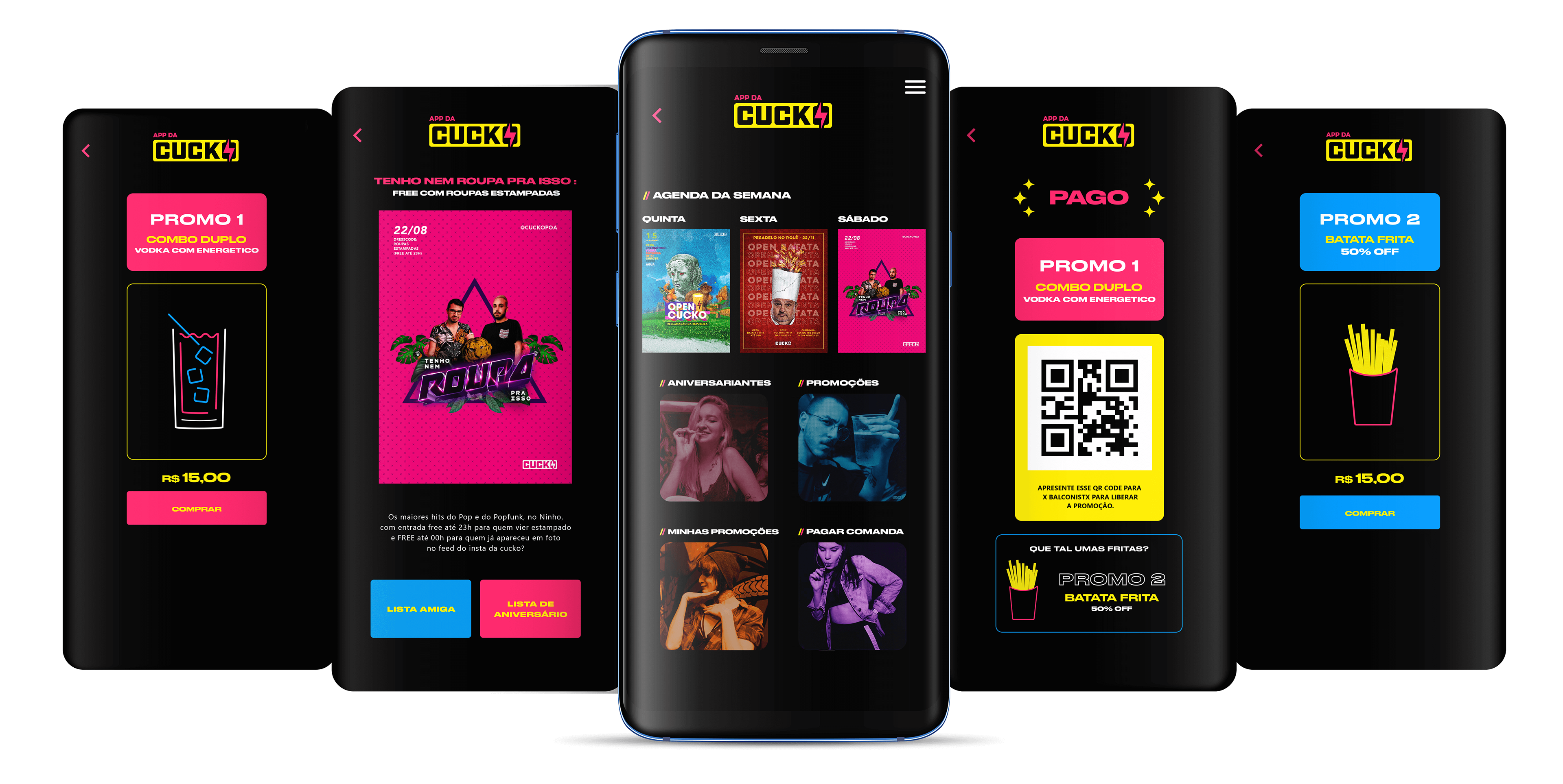
Delivery
Finally,I reach the double diamond's final half, where the MVP is available. With the results of the user testing, we made a few minor changes to the interface to improve the user experience. Make it simpler:
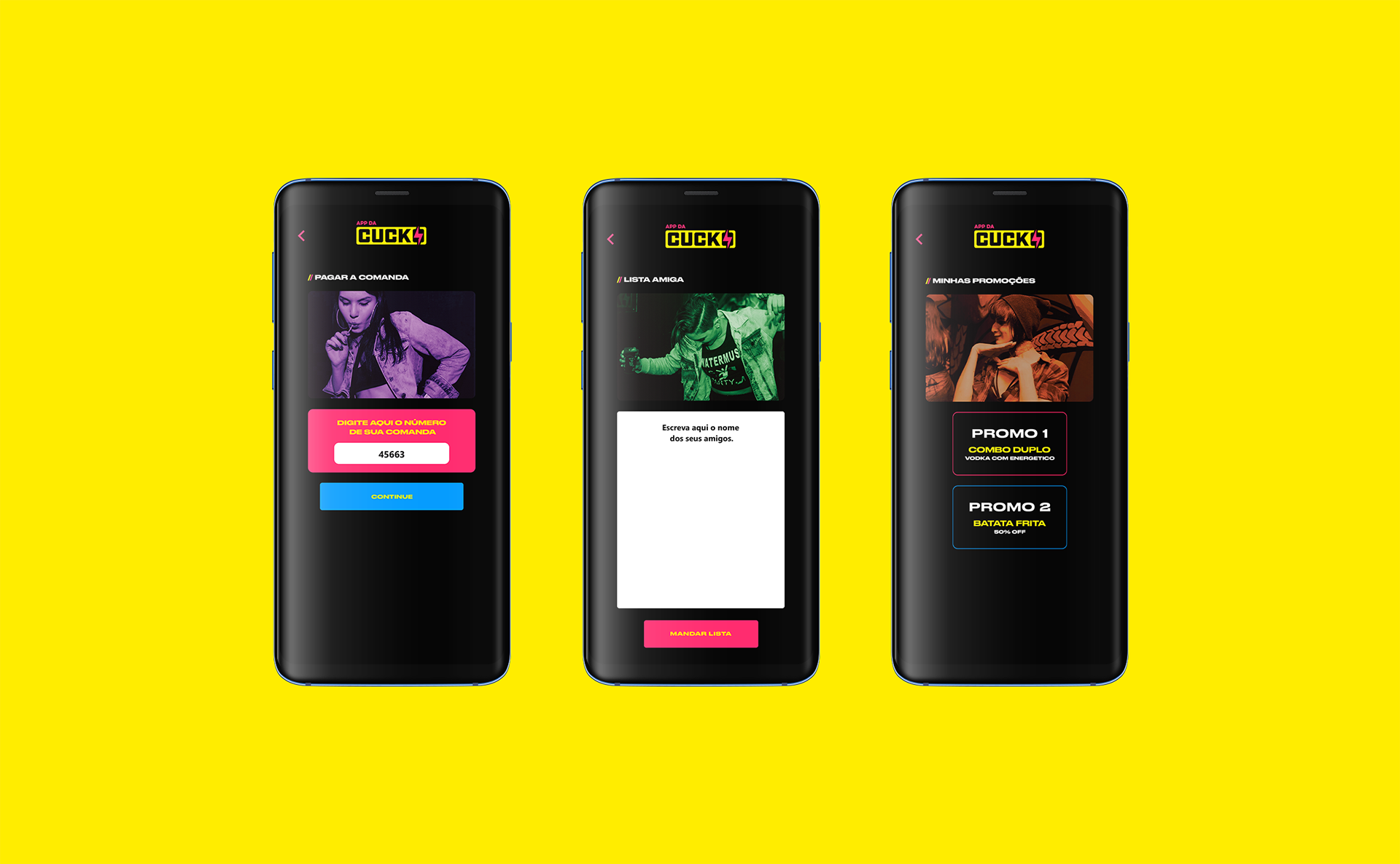
User Interface
A look at the app's interface and key features.
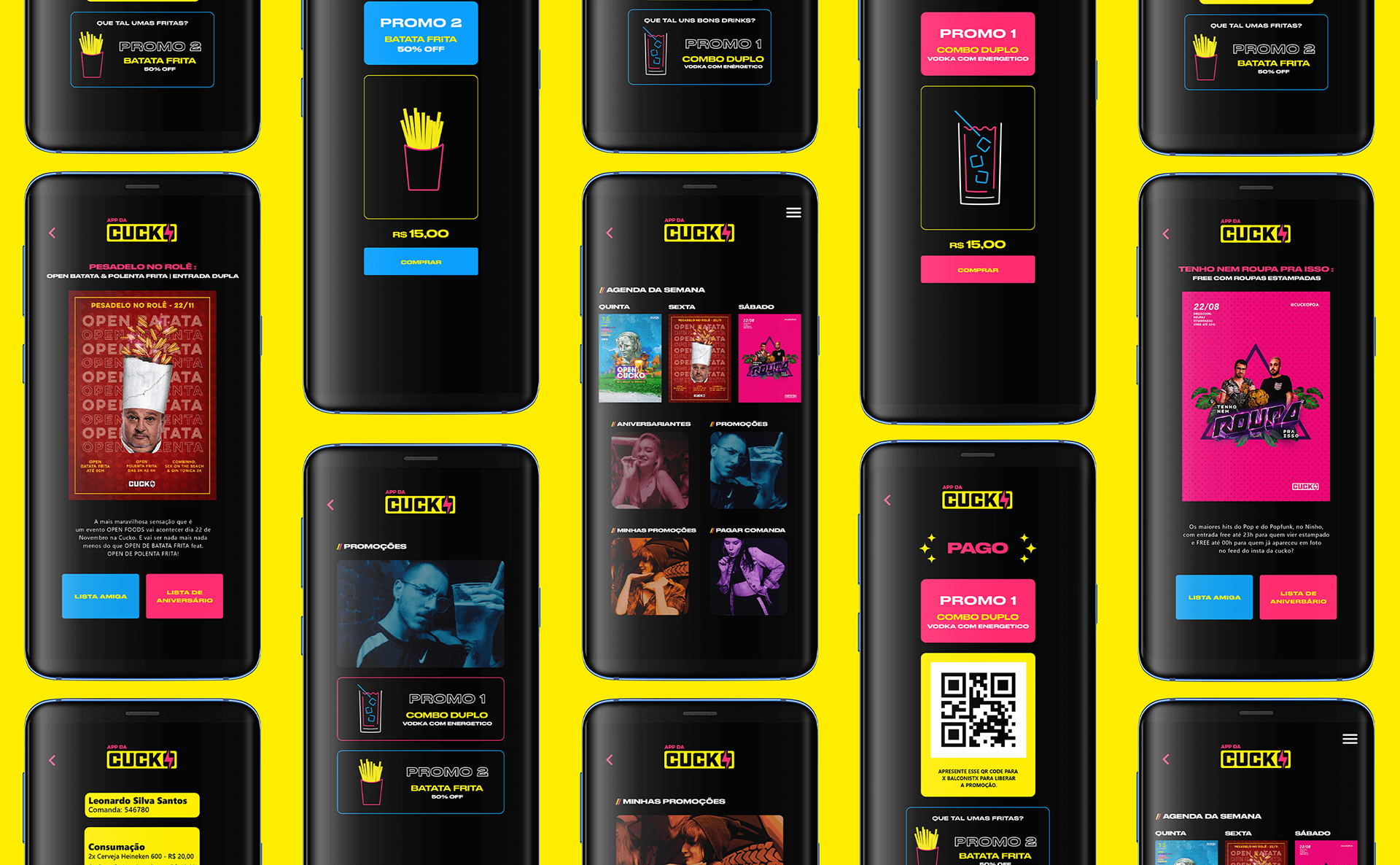
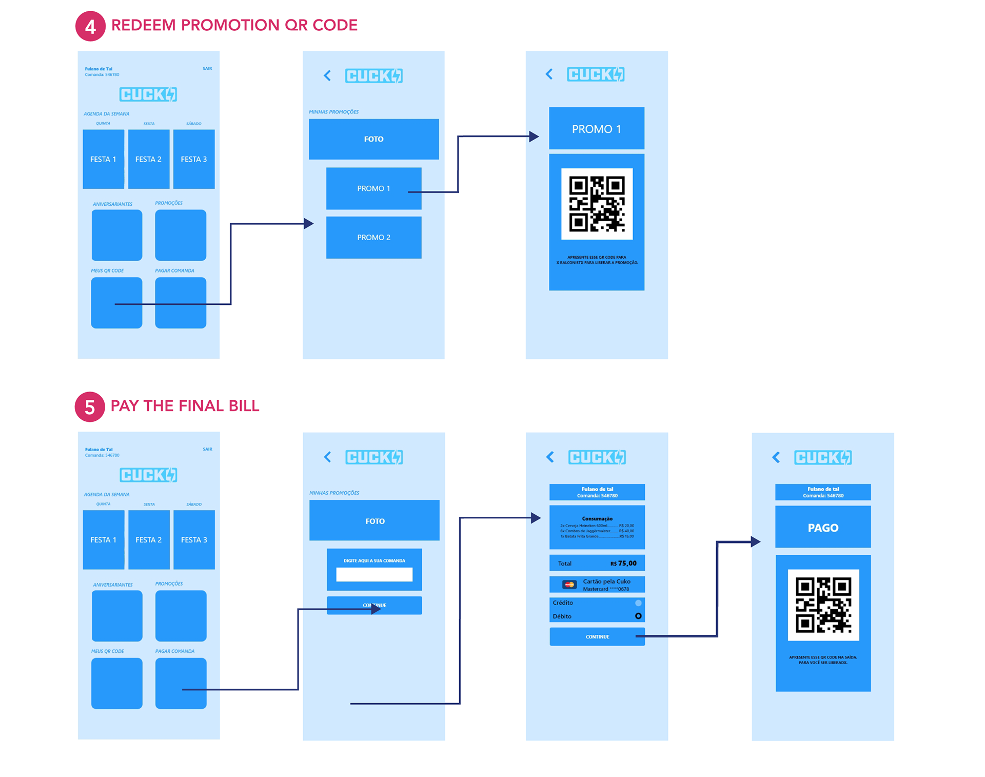
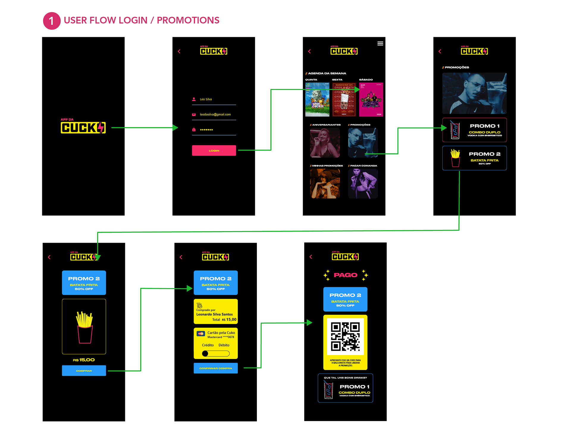
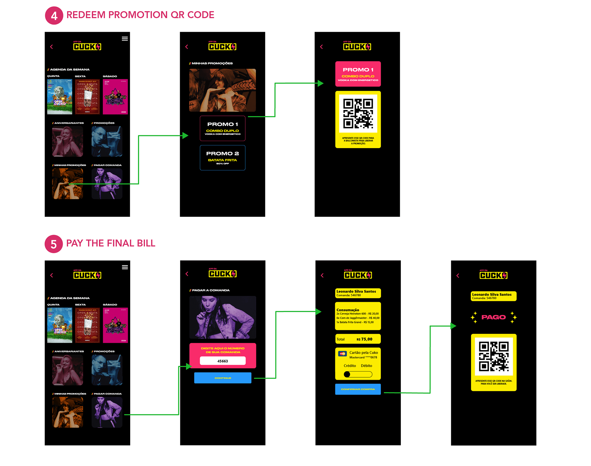
Feature Pay the Bill
This is probably the most important feature because it solves a real-world issue, such as the inconvenience caused by customers when the club is crowded. At the time of checkout, the user can enter the order number. And it can pay with a credit or debit card to generate a QR code which will be shown to the hostess at the club's exit.
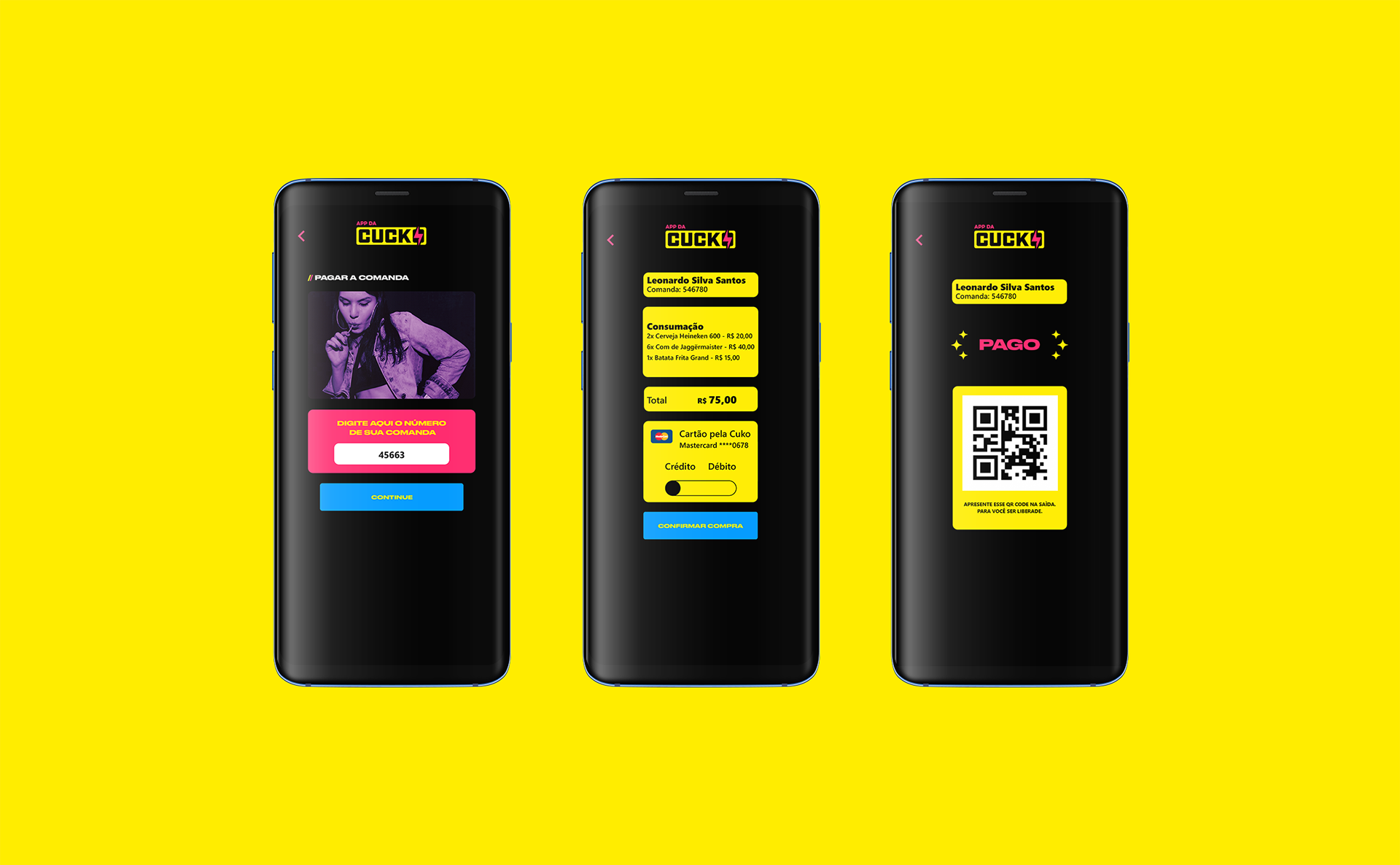
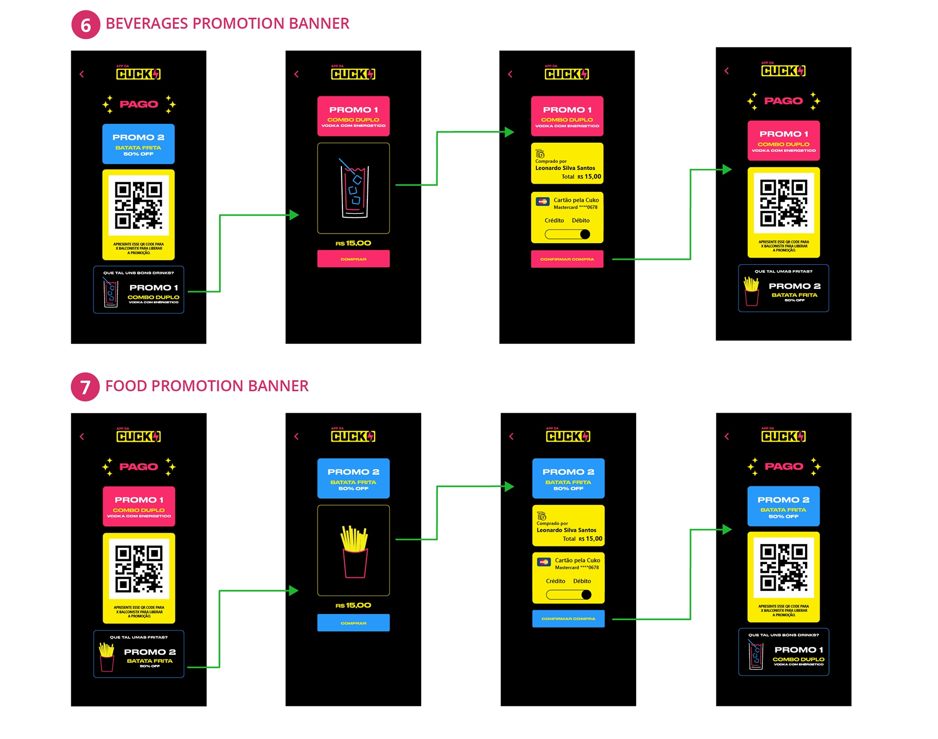
Feature Promotions
This feature provides discounts if the user purchases food or beverages through the app, and it helps to improve people's flow at the three bars that operate within the club. Some minimal illustration icons for food and beverages were made, resulting in a more contemporary visual design. The checkout screen includes a tiny banner that suggests the user purchase accompanying goods.
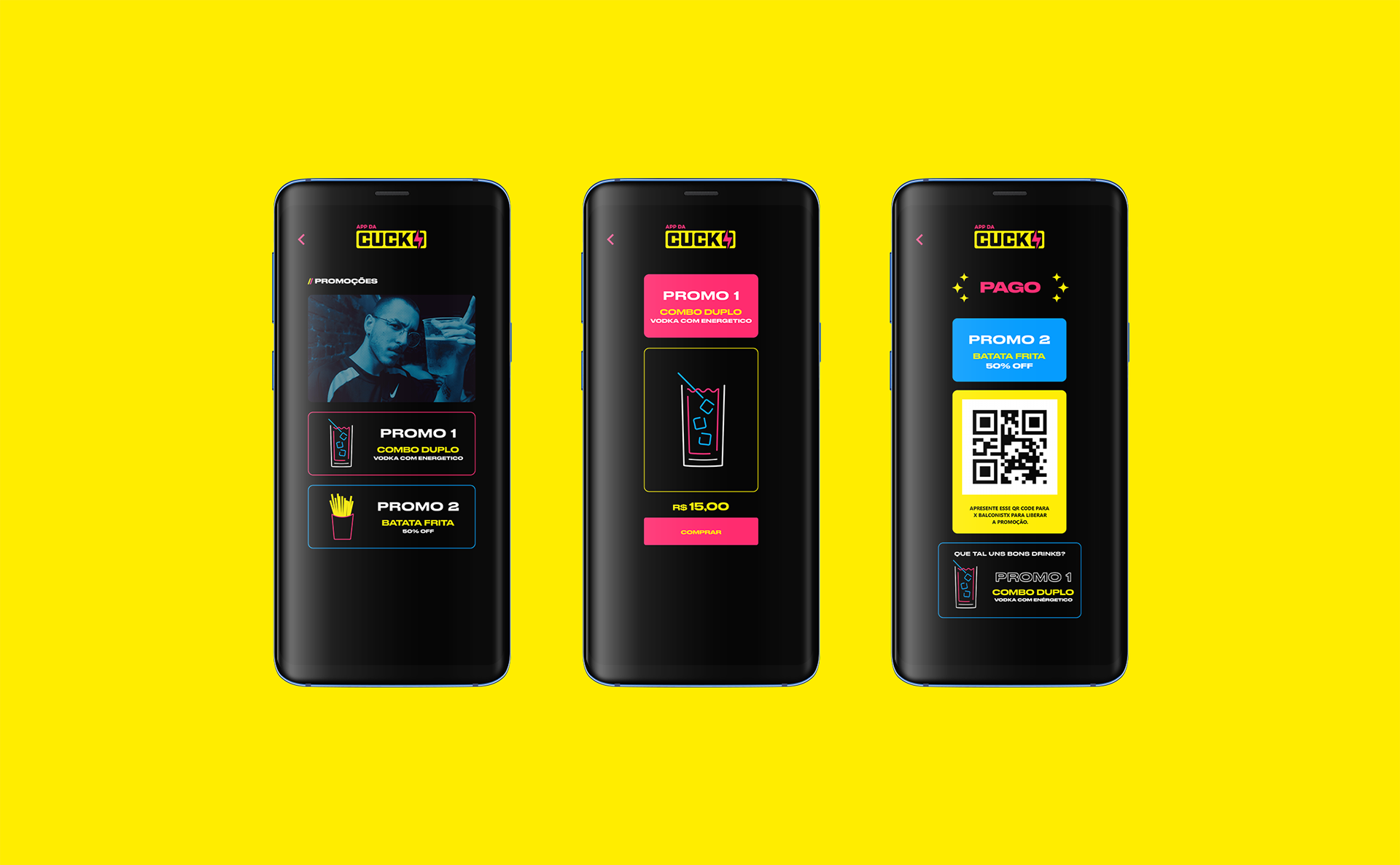
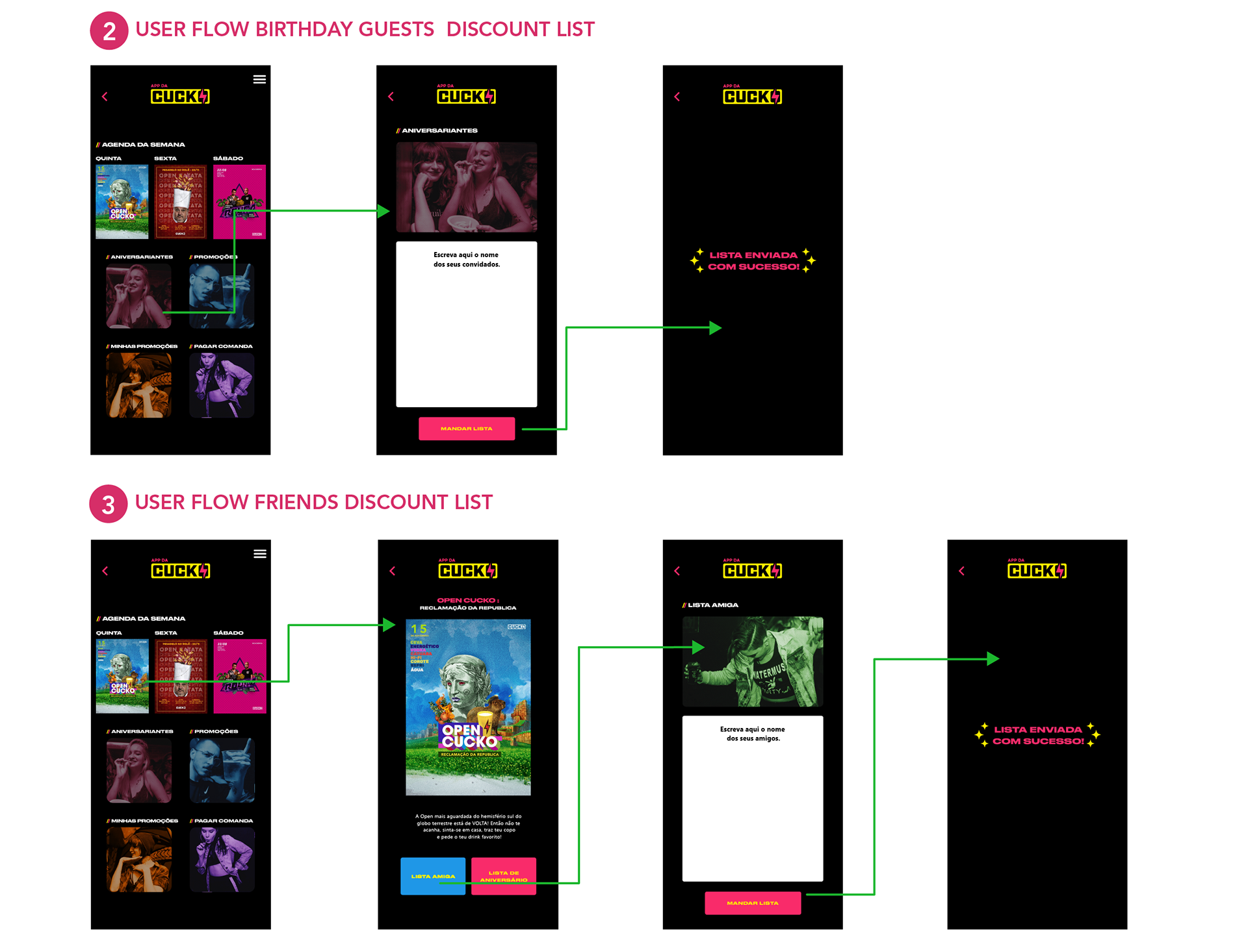
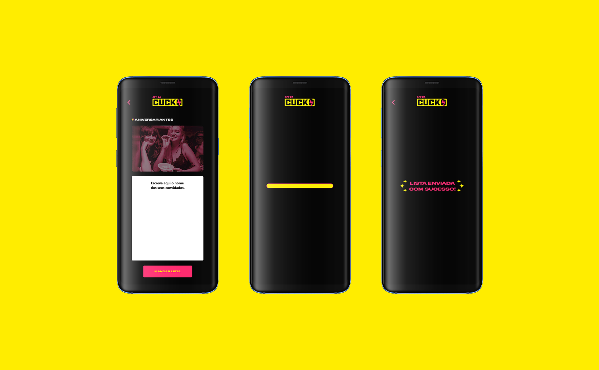
Ticket discount lists
This was the sole feature that remained on the original club website. You can send ticket discount lists with your friend's names and birthday guests, ensuring a significant volume of people using the app and making the customers' journey smoother.
Representativeness
This is crucial for the Cucko's regulars because the general public deviates significantly from the normative standard, and the club serves as a second home for them.
As a result, we used real photos from the regulars to illustrate the user interface screens, forming an effective link with them.
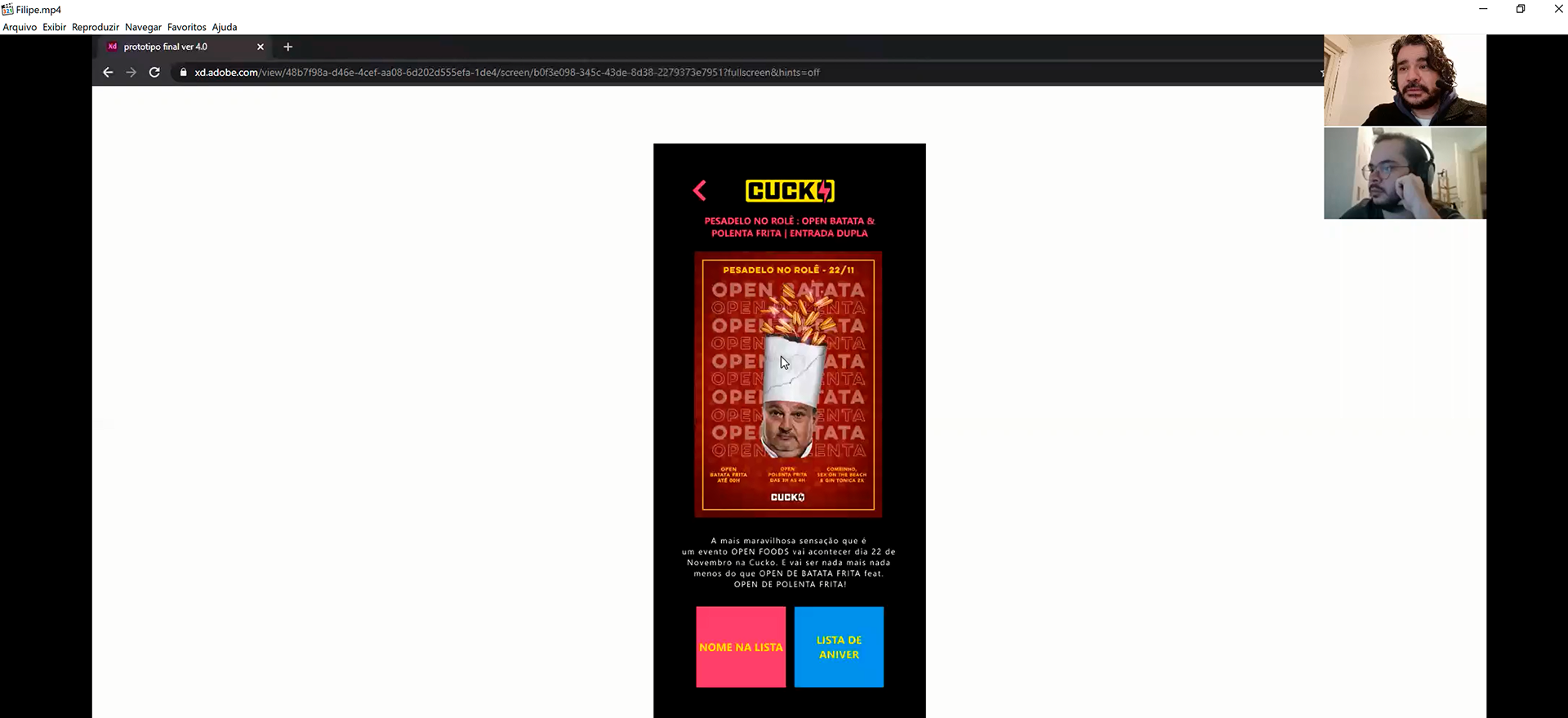
Here's a look at the most recent prototype version.
Final Thoughts
Despite of the user tests, this product's responsibility does not end there. We are always trying to improve, adapting to changing scenarios, and seeking new user experiences. We must always put human valor into our work in order to bring delight and happiness to our users. If they are pleased with the product, they can recommend it to others and become evangelists.

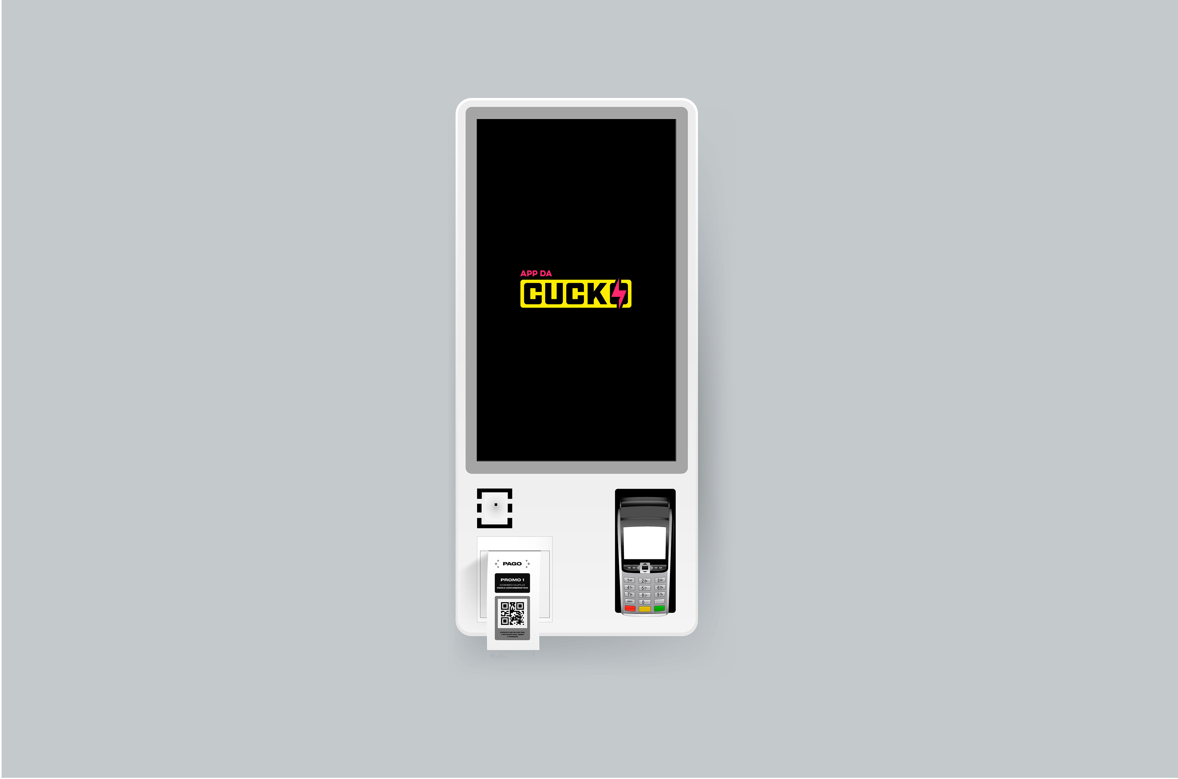
Self-service terminal
In a post-pandemic scenario, even if it is risky for the club to implement its own app, this system can be readily transformed to self-service terminals within the club. In this situation, the product will be emphasized by paying final bills and purchasing food and beverages. The user can print a ticket with a QR code and show it to the bartender or the hostess to exit the club without having to wait in large lineups.
It demonstrates that the user experience can be flexible and that the product solution may be implemented in a variety of situations.
Thank you for reading my case 🙂